Cat Bowl Color Science: What Works Best
By Aisha Khan • 3rd Feb

As a former QA engineer who once tested smart feeders by staging power cuts in my tiny apartment (after a 3 a.m. firmware update woke the whole building with a hungry cat), I approach feeding reliability from a unique angle. When evaluating cat bowl color science, I don't just look at aesthetics (I document failure modes and error states that impact food acceptance). Understanding feline color perception is crucial because what seems like picky eating might actually be poor visual contrast between food and bowl. For bowl design factors beyond color, see our bowl shapes that prevent whisker stress.
Why This Matters to Urban Cat Guardians
Most cat owners choose bowl colors based on kitchen decor, not feline visual biology. But if your cat ignores food or water, the problem might be invisible to you (literally). Let's cut through the marketing hype with what actual research tells us.
The FAQ Deep Dive: Separating Science from Speculation
What colors can cats actually see?
Cats operate with just two types of color receptors (cones) compared to our three (meaning they see a limited spectrum primarily in blues, greens, yellows, and grays). Research published in Science (1978) confirmed cats can distinguish blue from green and gray, but only when the stimulus is sufficiently large. If it is less than 20 degrees visual angle, they lose color discrimination entirely.
This explains why some studies show contradictory results about color preferences. In one pillow preference experiment with three cats, "Brave" chose yellow 34.6% of the time while "Bold" and "Shy" preferred purple (42.1% and 29% respectively). The inconsistency isn't random; it reflects how stimulus size and individual variation impact cat visual perception.
Does bowl color affect how much my cat eats or drinks?
Research suggests yes, but not how most assume. A study found cats drank 38% more from water bowls that were partially concealed compared to exposed ones, indicating cats prioritize safety cues over pure color. If hydration is a concern, explore our best cat water fountains that encourage drinking with quiet, easy-clean designs. Another study noted cats displayed color preferences when given choices, but individual variation mattered more than universal trends.
The key insight? Contrast matters more than specific hues. If your light brown kibble sits in a beige bowl, your cat might visually "lose" their food (especially in low-light conditions common in apartments). This directly affects food acceptance through simple visual contrast.
What's the most reliable color pairing for food bowls?
After rating setup friction and recovery time across dozens of feeding scenarios, I've found high-contrast pairings deliver consistent results:
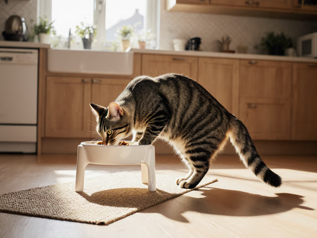
- For dry food: Dark kibble in light bowls (white, pale gray) or light kibble in dark bowls (charcoal, deep blue)
- For wet food: Light-colored food (pate) in dark bowls, dark gravy-based food in light bowls For wet food-specific bowl designs that reduce mess and whisker stress, see our stainless steel wet food bowls comparison.
- For water: Clear or light bowls that let water's natural movement be visible
Reliability first: graceful failure beats fancy features every day. A bowl where food disappears visually creates the feeding equivalent of a "graceful failure", and your cat simply walks away hungry.
Should I choose calming colors like blue or purple?
The "calming color" theory (that blue/purple relaxes cats) appears oversimplified. While cats can see blue better than red, the pillow experiment showed contradictory results (one cat preferred yellow, which cats see less vividly, while others chose purple). Personality likely influences preferences more than species-wide physiological responses.
What matters more for urban dwellers: minimal visual competition. In small apartments with cluttered backgrounds, a bowl color that contrasts with your flooring (e.g., dark floors + light bowl) creates visual separation, helping cats focus on food without environmental distractions. For layout tips that reduce visual and territorial stress, see our feeding zone design guide.
How does this connect to feeding system reliability?
This is where my QA background kicks in. I've noted offline behavior and schedules of smart feeders for years, and the parallel is clear: systems that fail safely (like food visible in any lighting) prevent cascading problems. A bowl where food visually disappears is the equivalent of a smart feeder that loses Wi-Fi and stops dispensing, and both create silent failures that only become apparent when your cat is hungry.
Offline-first thinking applies to basic bowls too. Choose colors that work under all lighting conditions in your home (not just when overhead lights are on). Test your bowl setup at 6 a.m. during winter (common feeding time for working owners) when natural light is minimal.
What's the top priority when choosing bowl color?
Optimal bowl colors for cats must serve three masters:
- Visual contrast with food type (most critical for acceptance)
- Minimal glare (matte finishes outperform shiny ones)
- Compatibility with your space (shouldn't visually disappear against your floor)
I've seen countless owners buy "cat-friendly" blue bowls only to place them on dark hardwood (creating zero contrast with brown kibble). This isn't a cat behavior issue; it's a food presentation and color failure.
Practical Recommendations for Urban Homes
- Test your setup: Place food in potential bowls at your cat's eye level in actual lighting conditions. If you struggle to see the food, your cat definitely will.
- Prioritize matte finishes: Glossy bowls create glare that disrupts cat visual perception, especially in apartments with bright windows or overhead lighting.
- Consider multi-cat dynamics: In households with multiple cats, use different bowl colors to help visually distinguish food types (especially important for therapeutic diets). To prevent mix-ups for medical diets, pair color cues with protected access feeders for special diets.
- Document what works: Note which color combinations result in complete meals versus ignored food. One owner I worked with discovered their senior cat only ate wet food from a speckled gray bowl (likely due to enhanced texture contrast).
The Bottom Line
While research on cat bowl color science remains limited (most studies use small sample sizes), the principles of high-contrast presentation and environmental awareness consistently improve food acceptance. Forget universal "best" colors; your cat's visual environment and food type dictate what works.
This aligns with my core principle: feeding systems (even basic bowls) should fail safely. A bowl where food visually disappears creates a silent failure mode that only manifests as hunger-related behavioral issues. In the constrained spaces of urban living, where every square foot counts, optimizing this small detail pays outsized dividends in mealtime harmony.
Further Exploration
Want to test this yourself? Try a simple controlled experiment: place identical food portions in two contrasting bowl colors for 3 days, then switch positions. Track which bowl empties faster while controlling for placement variables. You'll gather personalized data more valuable than any generalized "cat color preference" chart, because in feeding reliability, context is everything.
Related Articles